Eva Abdulina about Austra and her love for Latvian heritage
Eva Abdulina is a designer from Riga, Latvia. She made a typeface called Austra that was born out of her love for Latvian heritage in lettering and typography from the early 1920s up until now. The typeface embraces robust and sturdy letterforms in combination with fluid and geometric roundness. It is intended for everyday use, but with a pinch of historic uniqueness.
Due to lack of opportunities in Latvia, she has a bachelor’s degree in visual communication from Bournemouth University, England, and a one-year Master of TypeMedia course from the Royal Academy of Art in the Netherlands.
“Graphic design focused more on graphics themselves, but I was more into the communication itself and different campaigns and how to really get the message across.”
We met with Abdulina over zoom and asked her some questions regarding her work with Latvian design and typefaces. She focused her graduation project on creating a typeface, and at that time she was thinking about merging things, like which cultural inputs she could bring back home to Latvia, and which ones she could bring from home to her studies. Her typeface was based on the rich history of wooden architecture from Russian times, which all have a very decorative façade. At the time she graduated it was popular to purchase these wooden buildings and invest in them. “The government was also funding it and I was thinking that it would be fun to play with, type and those wooden ornaments. So that's what I did. I created a typeface and laser cut the wooden blocks themselves, so it was printable, like letterpress.”
Abdulina went back home to Latvia after her studies and worked with Overpriced, but after two years she wanted to focus more on type again. She then went to the Netherlands TypeMedia at the Royal Academy of Art, which is known for being the most serious and difficult typography course in Europe. She began working on Austra here, because of her interest in bringing something back to her home country. She says that Latvia has always been a battlefield, and was under Soviet, Swedish, and German influence for a long time. “We didn't really have the financial capacity to create our own typefaces, and there was no need for that, because we always had the German or the Soviet ones. There are typefaces made by Latvians today, but they are maybe influenced by art nouveau, which we have a huge history of here, but the typefaces are not widely used or very well papered for usage. It's still very, very new, and that's one of the reasons why I decided to come back.”
When we asked Abdulina if she thought moving and seeing other cultures affected her work, she agreed, and said that what you have at home and what you can bring back sort of crystallizes in your mind. She also thinks that freedom of thought in the UK gives you the opportunity and possibility to take whatever project you have in mind and realize it. “You don't necessarily have to answer directly to the question asked, but you look for other ways of dealing with the problem.” She also told us that in the Netherlands, the accuracy of the work is something that really struck her, how diligently people work, and how the attention to detail is just insane. “There are some characteristics that I've brought back,” she says.
Regarding the question of this mixture of cultures, she said that “we talk more and more about the question; what is Latvian design? What's the essence of it? And some people do try to prove that we have our own style. But like, realistically speaking, we've been a country for less than 100 years, with the Soviet times in between. We have this salad for Christmas that’s called Rosols, that basically everything goes in. Whatever you have in the fridge, you just chop it up and put it in the salad. In our studio, we call Latvian design Rosols because there are so many influences that have affected it. We just pick the brutalism from the Soviet times, the decorations from the Russian Empire, so then it's just like a mixture. It's not like Scandinavian design that you can just pinpoint. With us, it's still very... somewhere in the air.”
Not having a lot of examples of Latvian design made the starting process very challenging. This was due to the original thought of creating something between the brutalist san serif with black letter, which is from German times, how the first Bible was written, and to merge that brush typeface with something very geometric. “I pushed myself so hard to try and marry them together, but it just didn't work. So, then I would print a text with one of the well-known typefaces here, and I would just look at it with squinty eyes to see the texture of it. We kind of realized that there are some particles that glitter because the typeface is in a way squareish but then in some places it's very round. So that's what I focused on, to make it prickly so it sticks out a bit, but then again, the round forms are very round. Then obviously another challenge was to make it work in a text because it must be legible in small sizes, and with that it brings another set of tasks that needs to be done. At the very beginning, it was very confusing, and I was very scared.”
“Austra is mainly made for text, because we don't have anything for text,” she tells us. “The typeface was used in Krišjānis Barons's book The Description of Our Homeland. He was walking from town to town and was the first man who wrote the description of the people who lived in the villages, the nature, and it was the first geographical document of our nation. The book was first printed in 1869 and now when the book was reprinted, we used Austra. It was a big honor to use the typeface in such an important book, and I was happy to see how it really worked and fit the context. I think that's what we are trying to do in Overpriced as well. We are trying to really merge the context with the graphics and the typefaces, so it makes more sense. I mean, we can imitate the western design as much as we can, but it's not going to give any substance.”
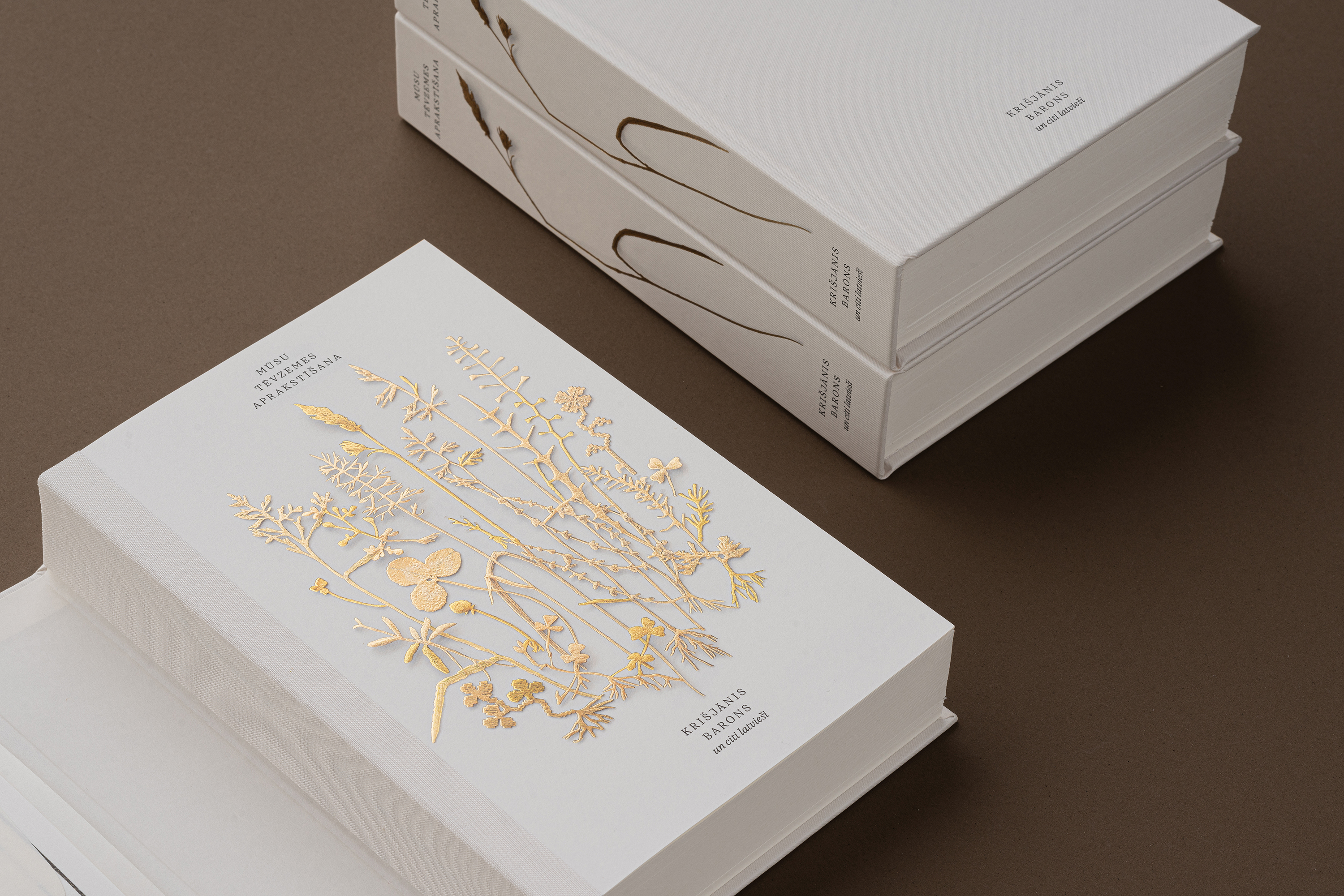
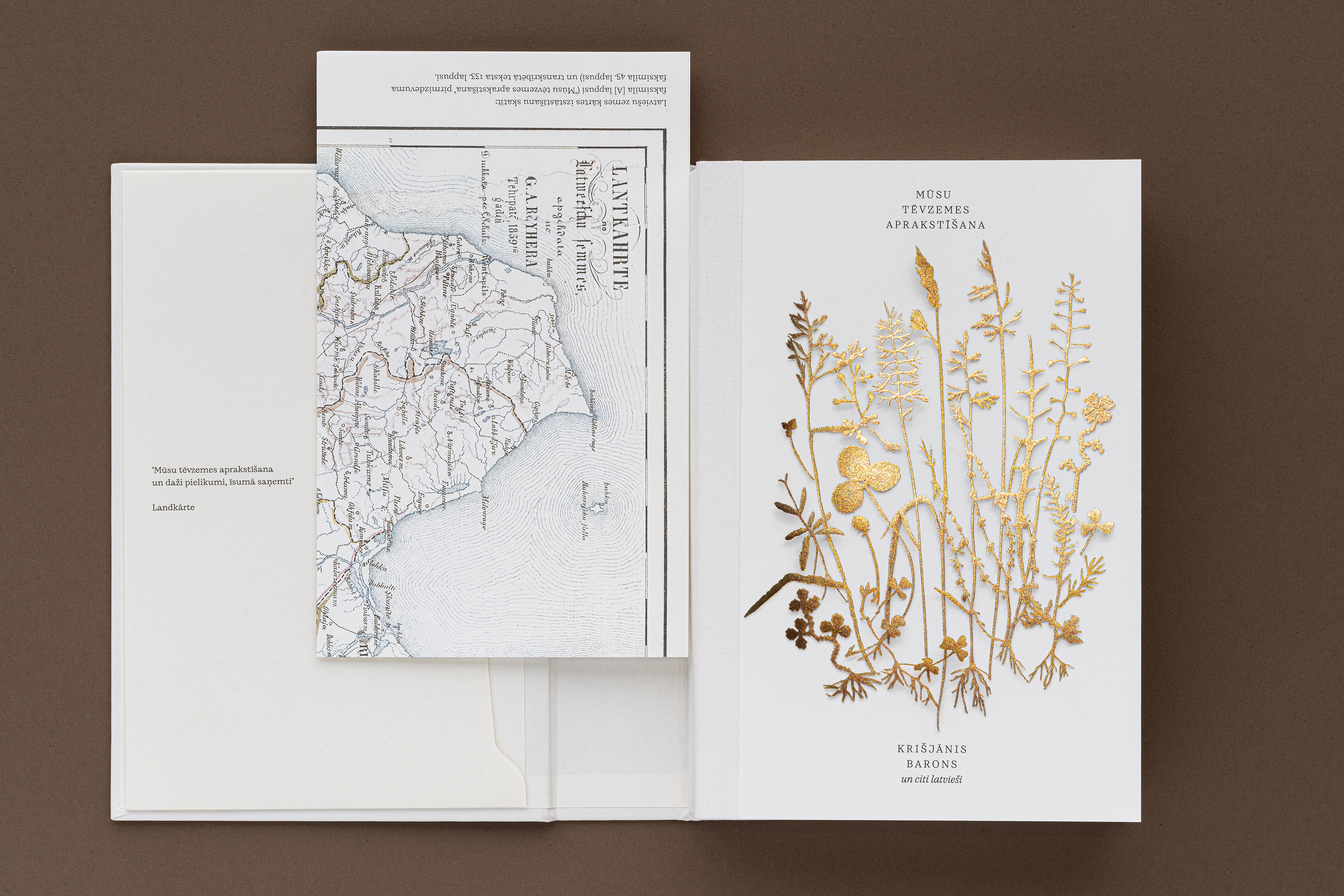
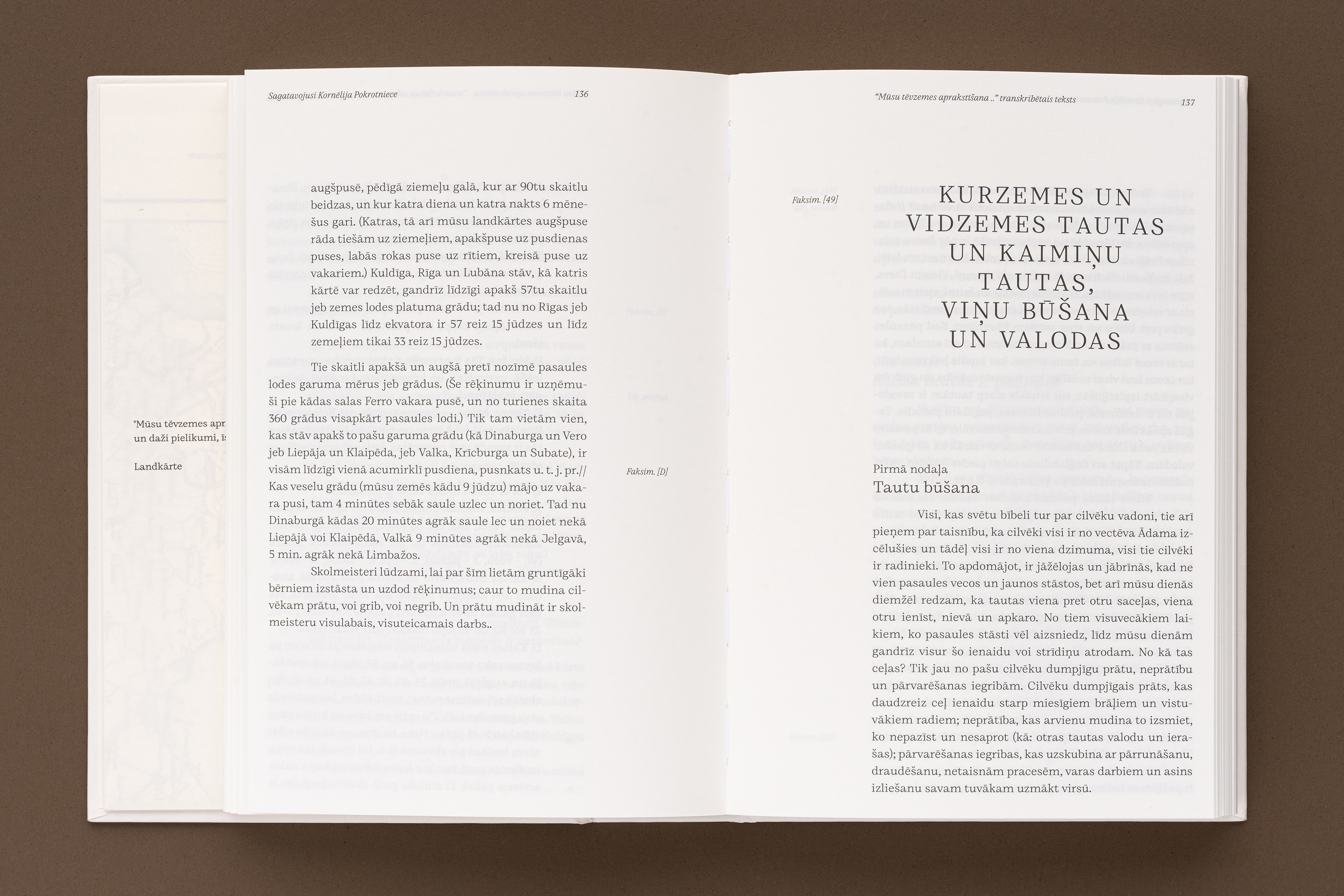
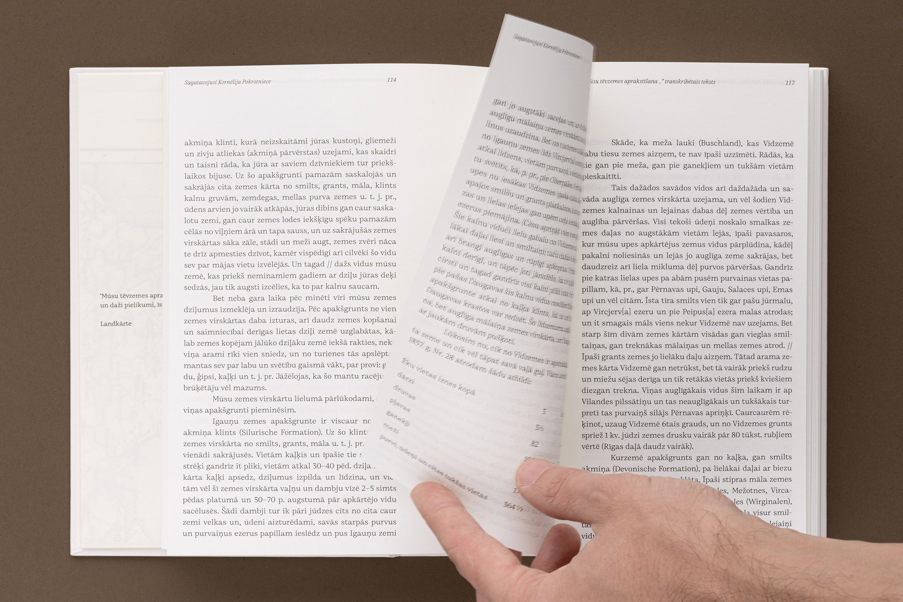


Above: The typeface Austra was used in Krišjānis Barons's book The Description of Our Homeland.


